







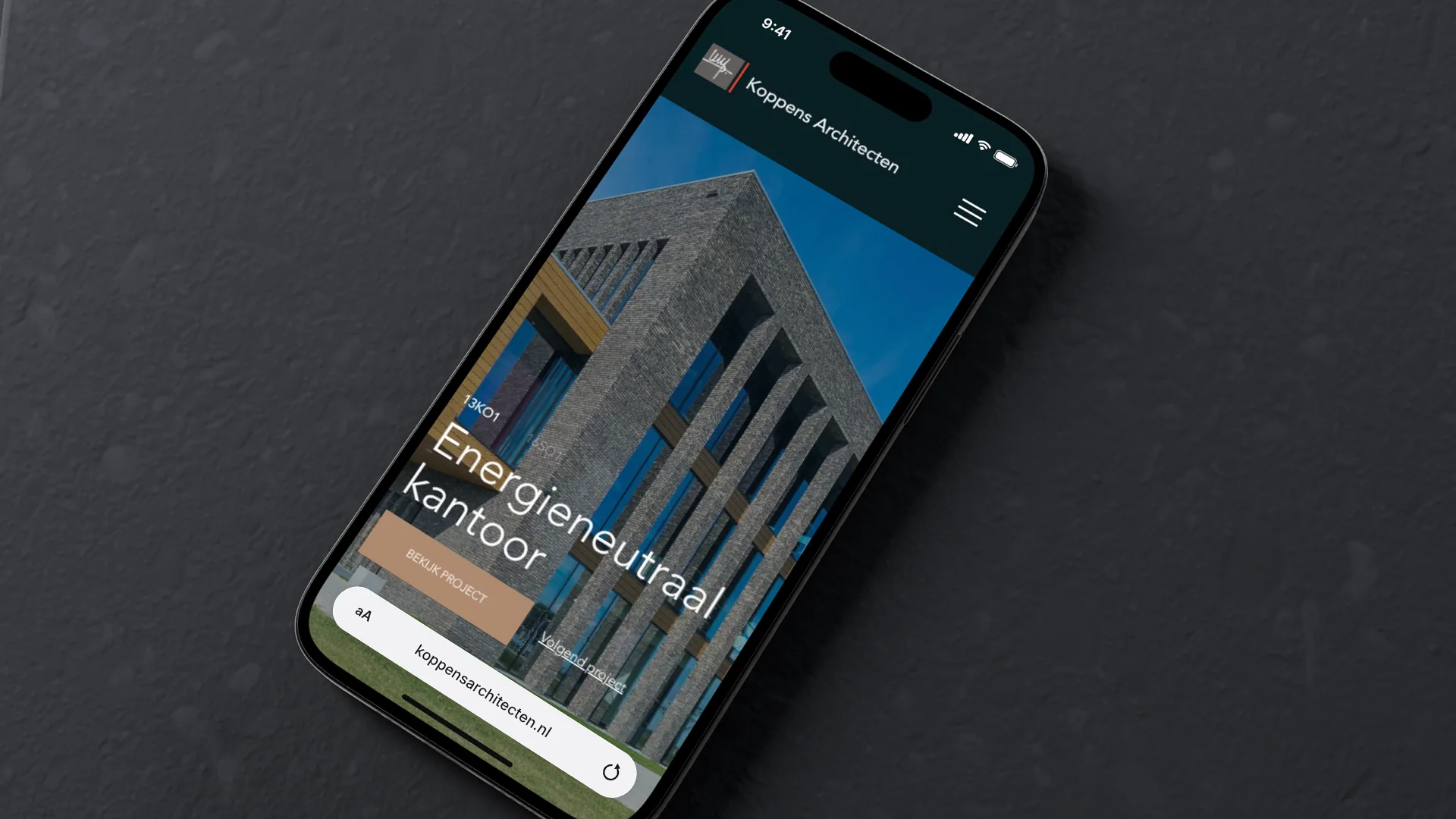

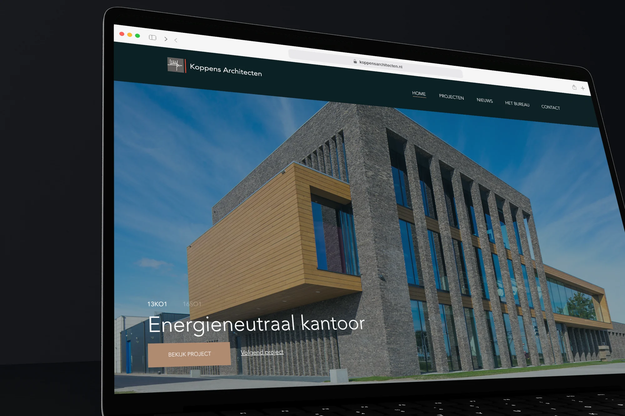
Branding and website for Koppens Architecten: a calm, image-led WordPress site that puts the projects first, in the identity with the signature and the red line.
- Client
- Architectenbureau Koppens
- Year
- 2022
- Tools
- WordPress
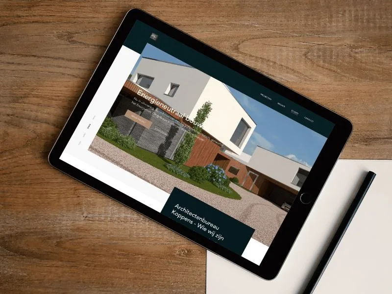
For Koppens Architecten we created the brand and the website. Online, the buildings come first, with the same red line as in the logo.
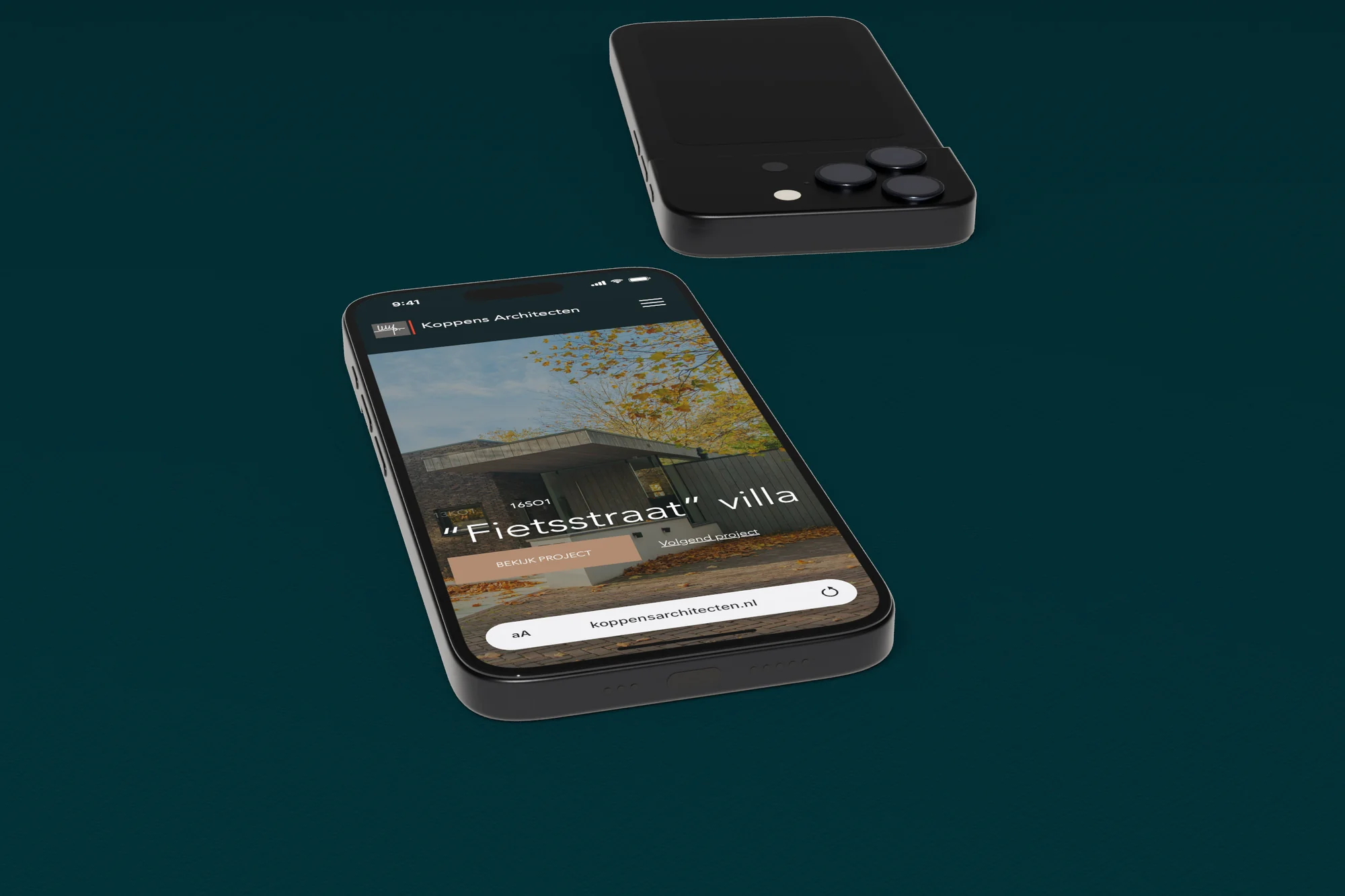
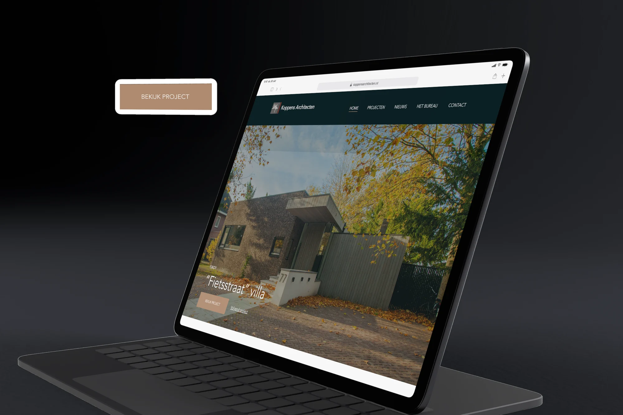
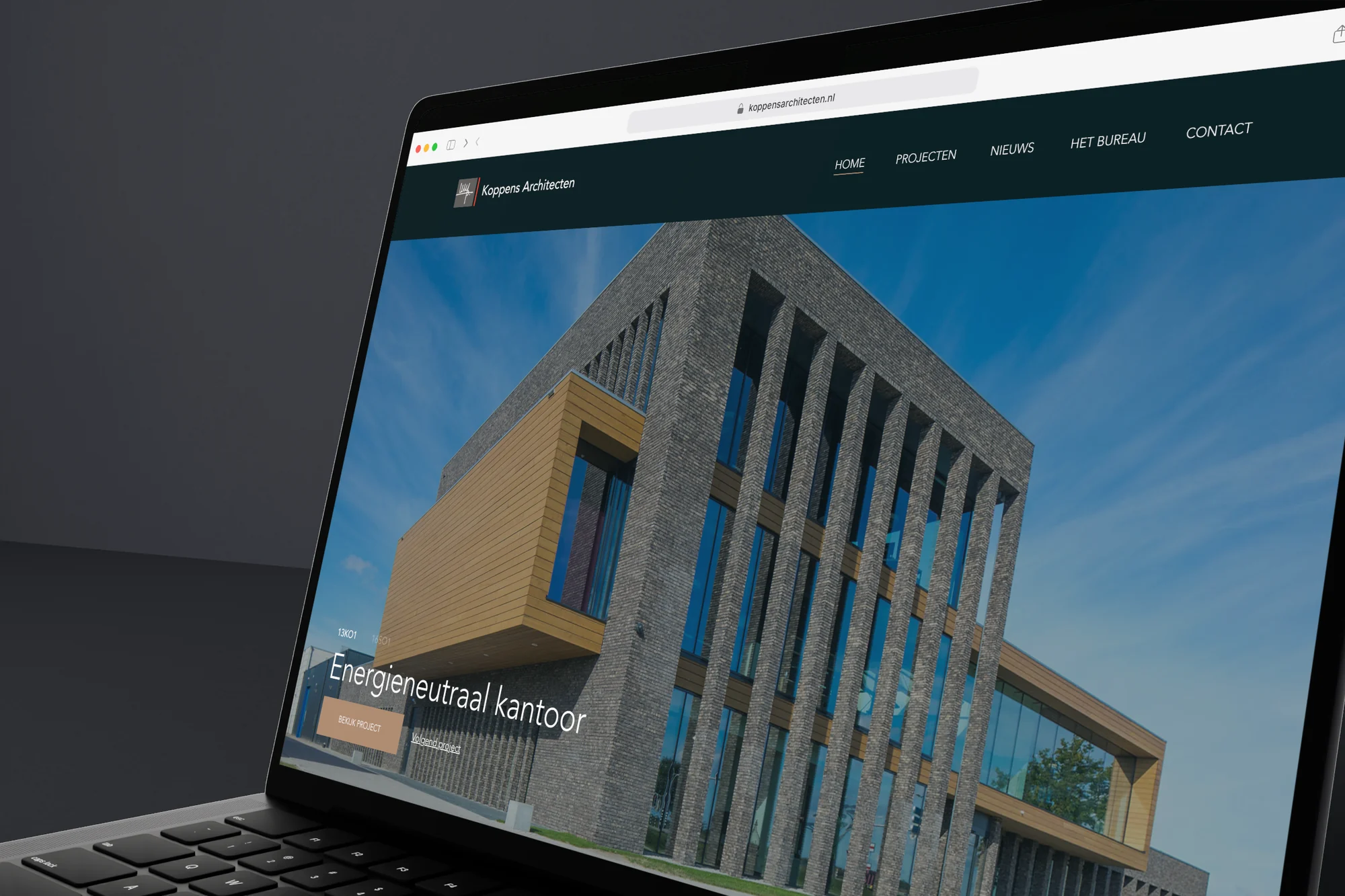
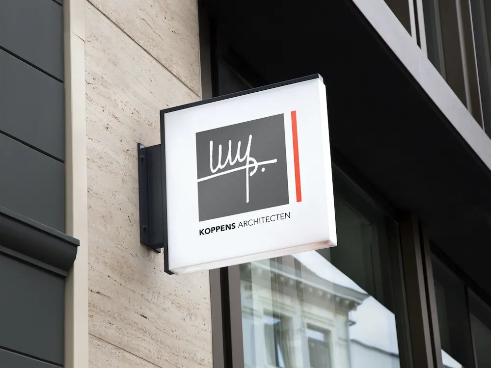
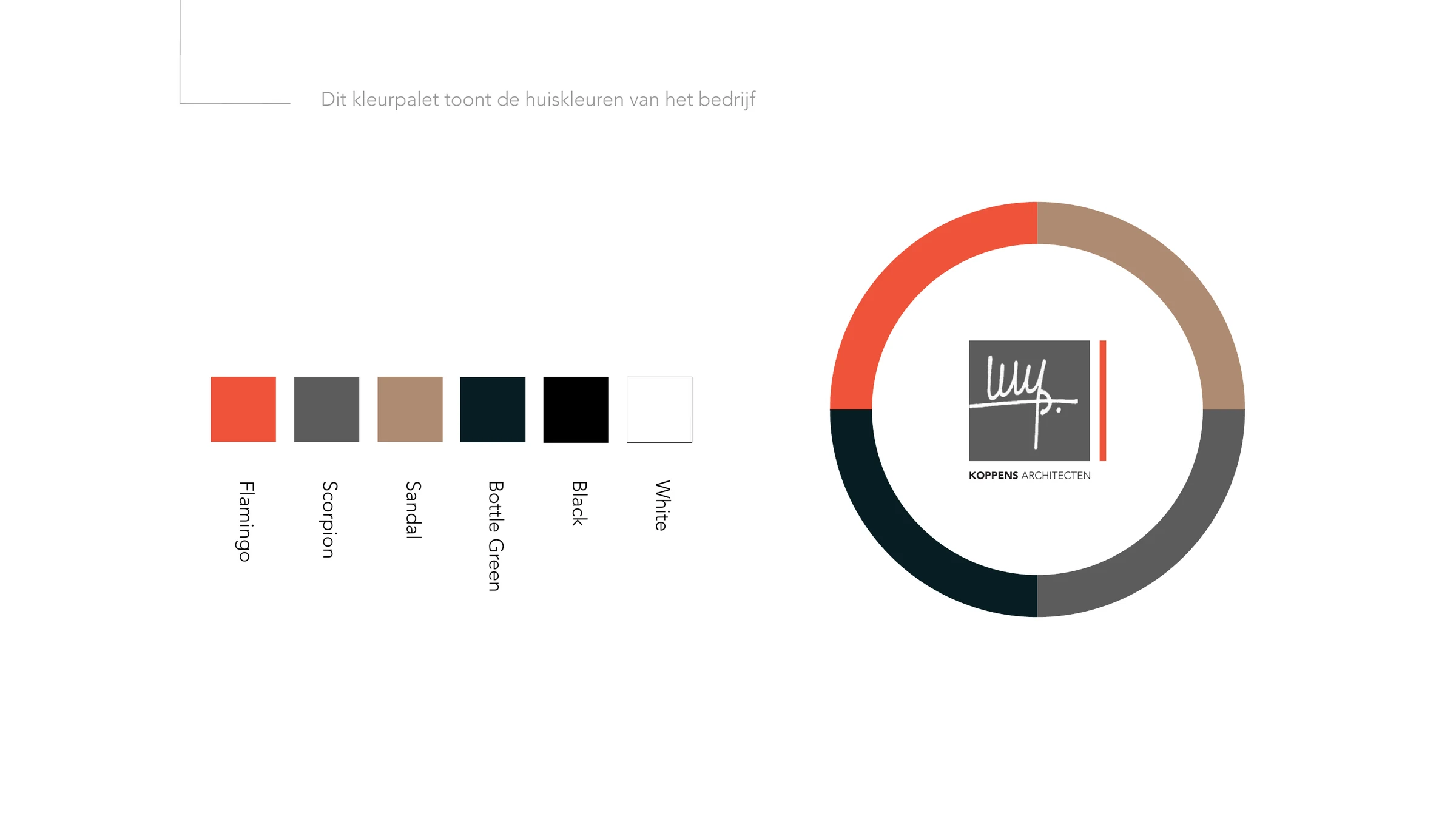
The mark incorporates the founder's signature in a cut-out style, with a red line beside it: the common thread through every project. We captured the colour palette, the logo variants and the separate brand elements in a brandbook. That identity is the foundation of the website.
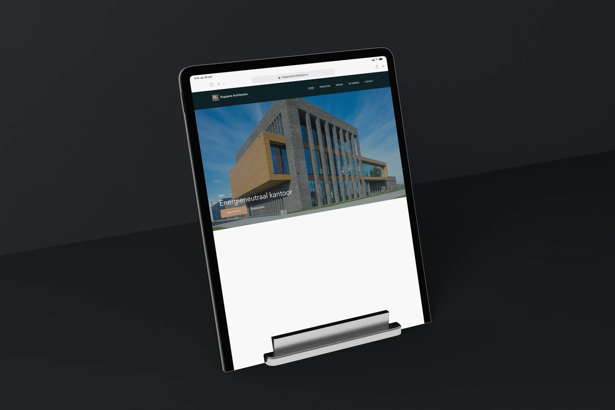
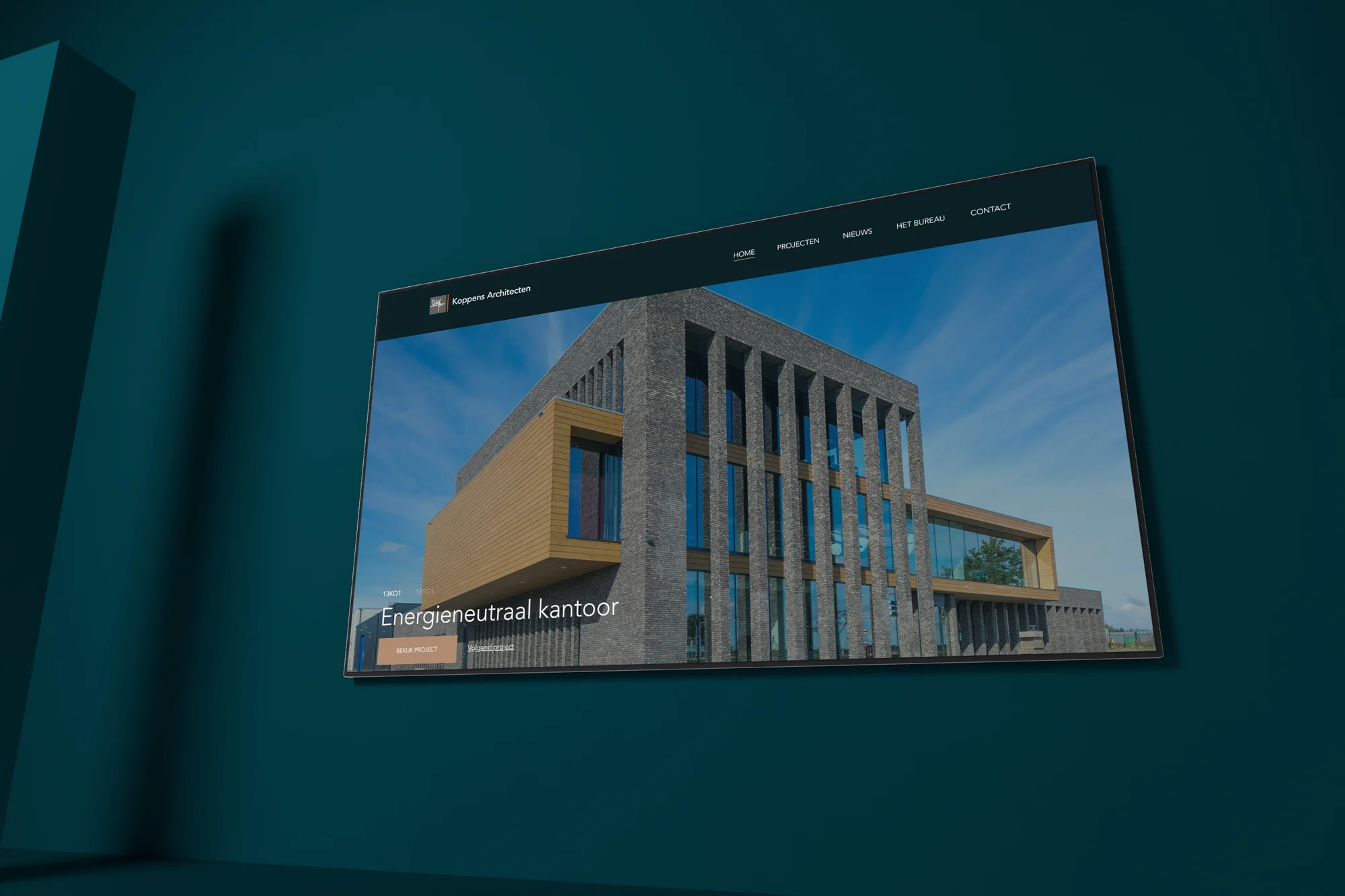
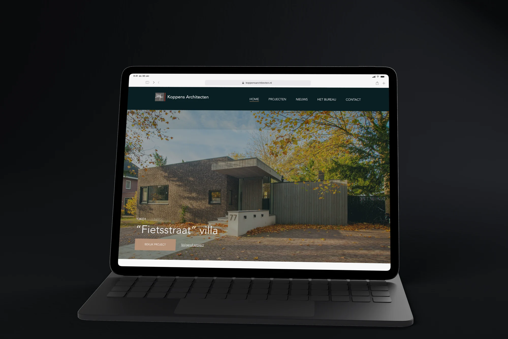
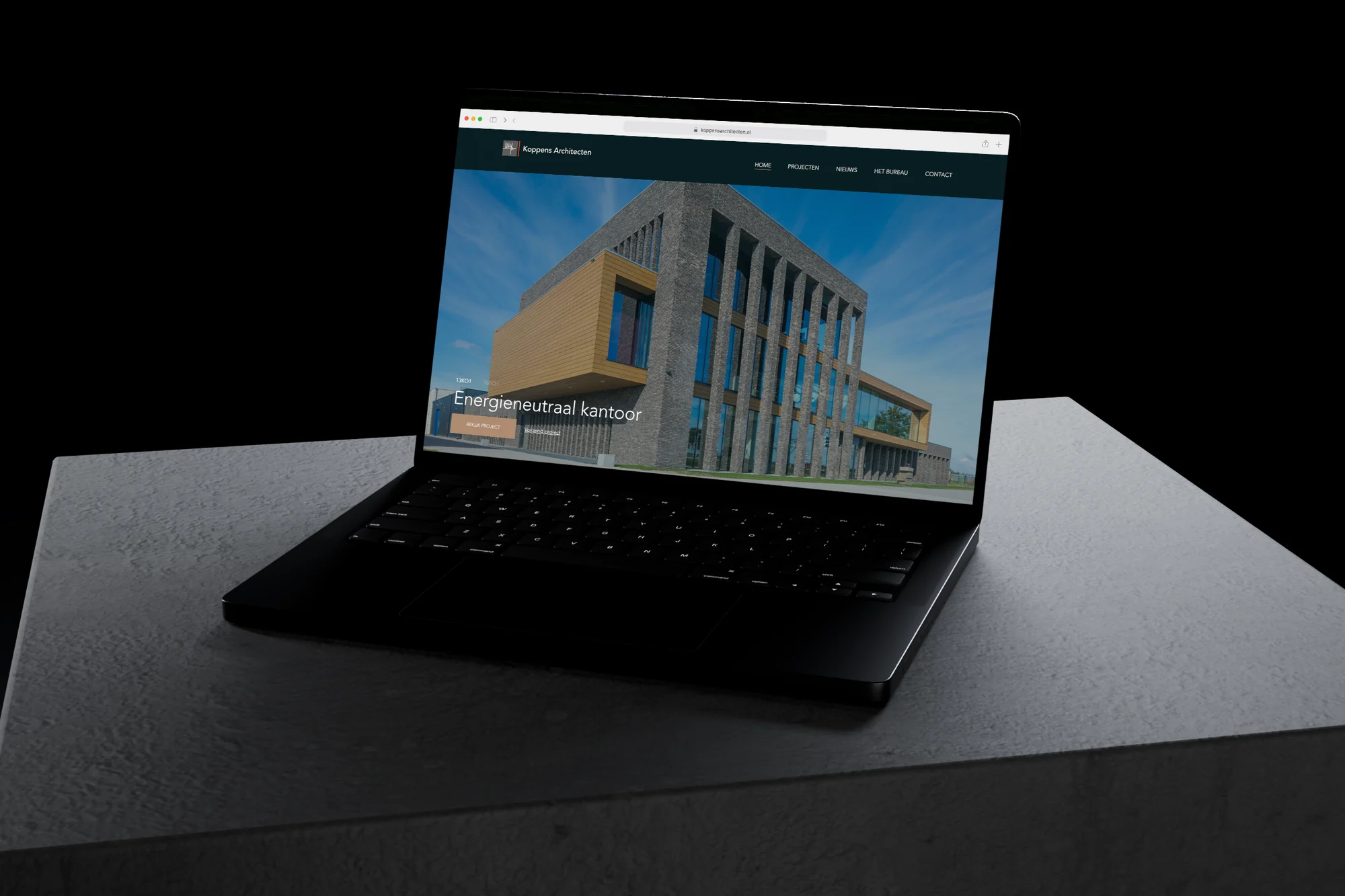
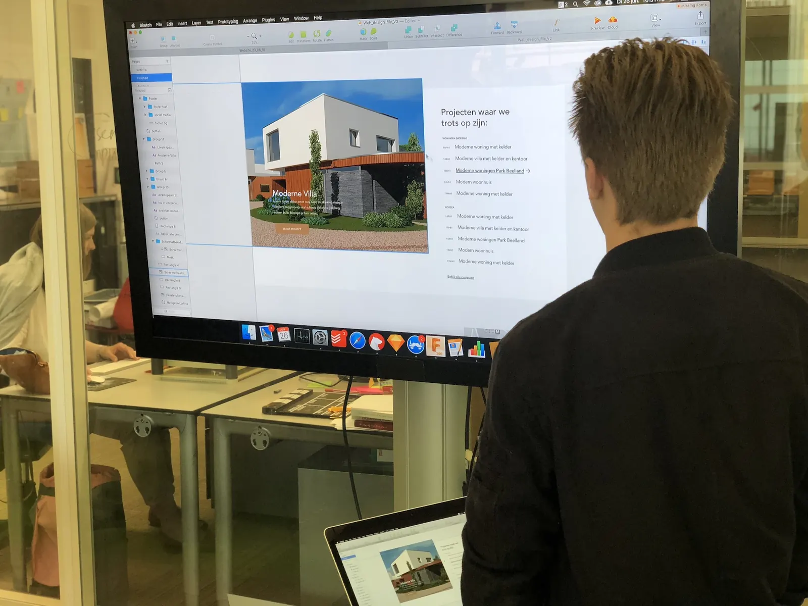
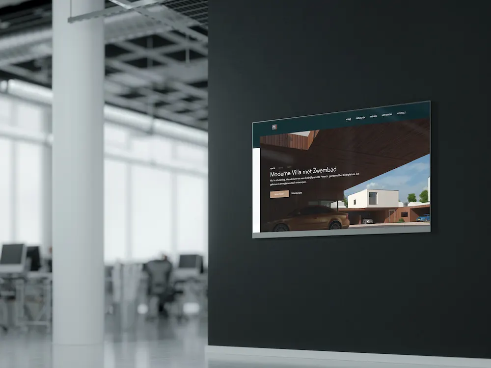
We chose large project images. The homepage opens with a slider of projects, from an energy-neutral office to the “Fietsstraat” villa, each with its own project code and a button to the project. They are followed by the firm's vision and a selection of projects per category: homes and new builds, social housing and hospitality.
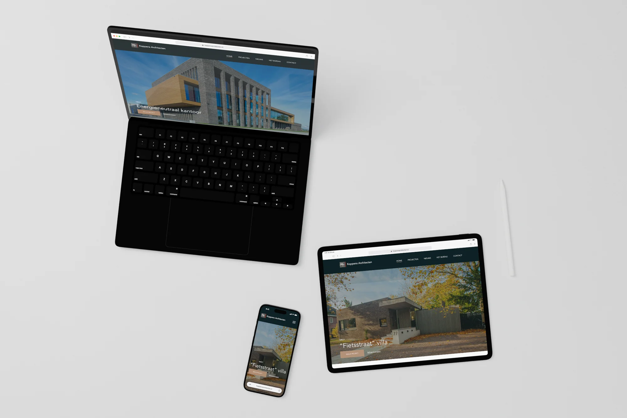
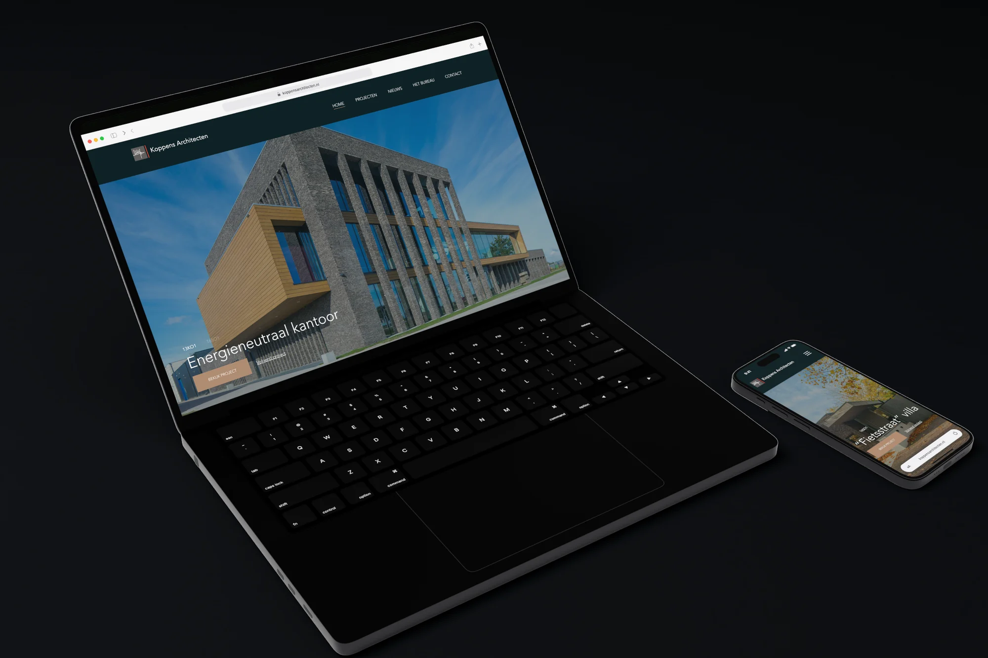
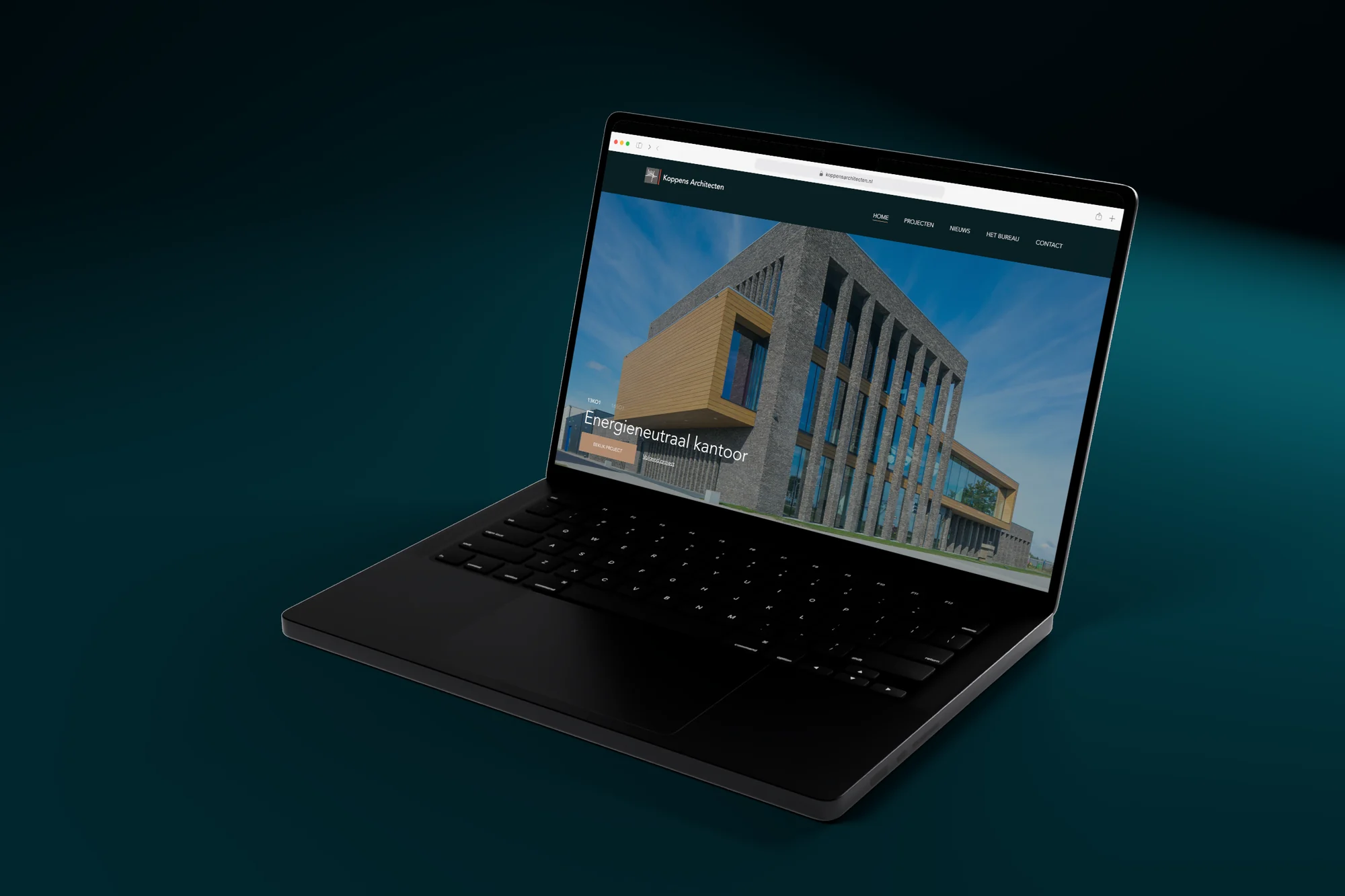
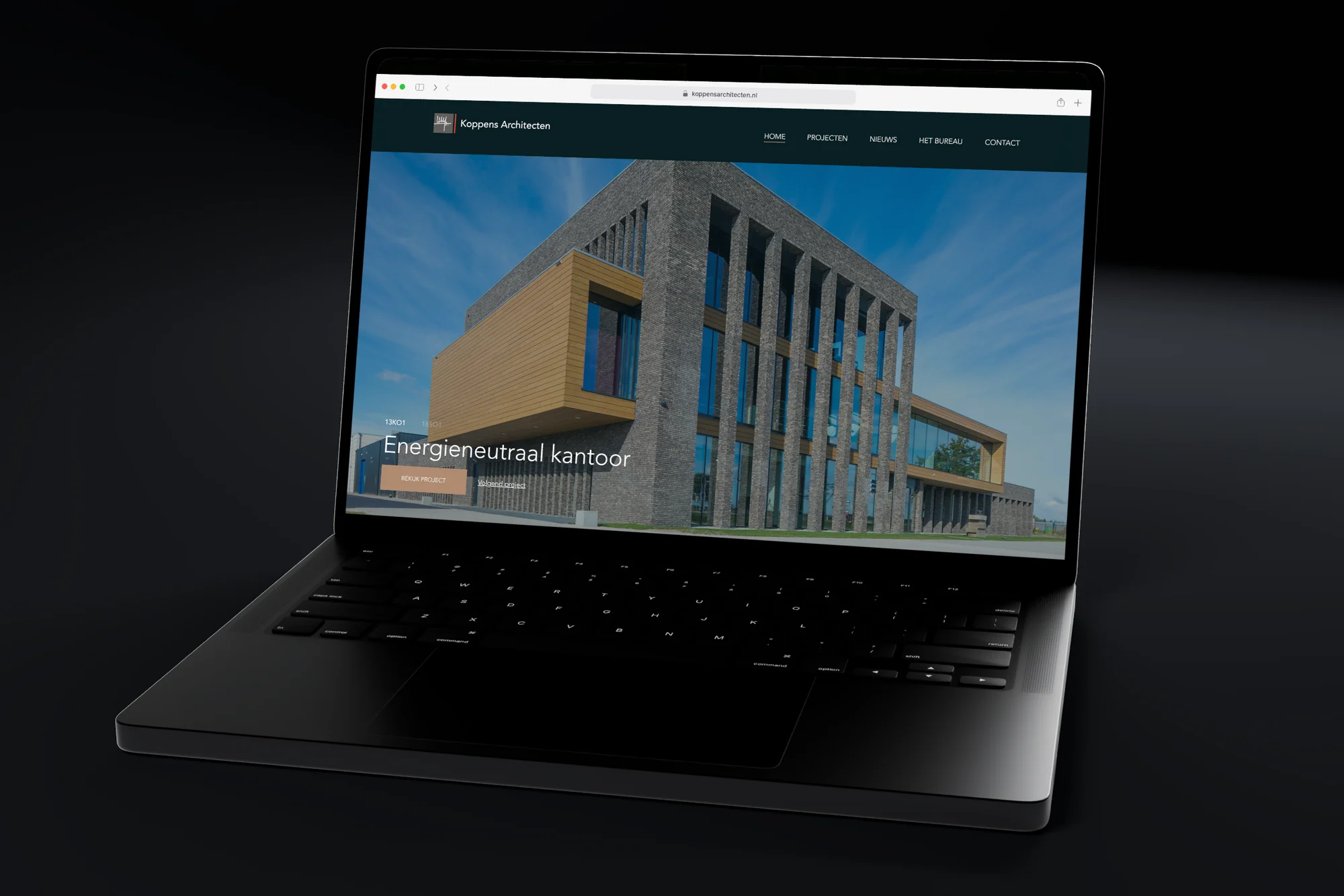
On mobile the menu opens full screen, with Home, Projects, News, The firm and Contact. The site runs on WordPress, on a custom theme, with a contact form at the bottom for anyone with plans for a new project.
0202
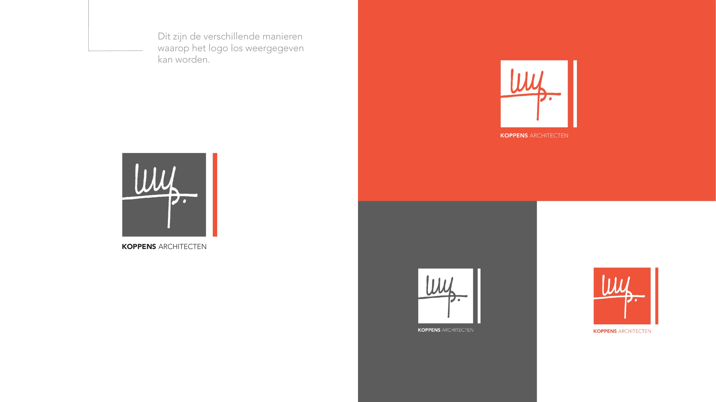
Logo and brandbook for Koppens Architecten: a mark with the founder's signature and a red line beside it, with colour palette, logo variants and separate brand elements.
Koppens Architecten designs from a conceptual idea in which form follows function. The brand had to make that common thread visible, and work on the facade, on office and marketing items and online.
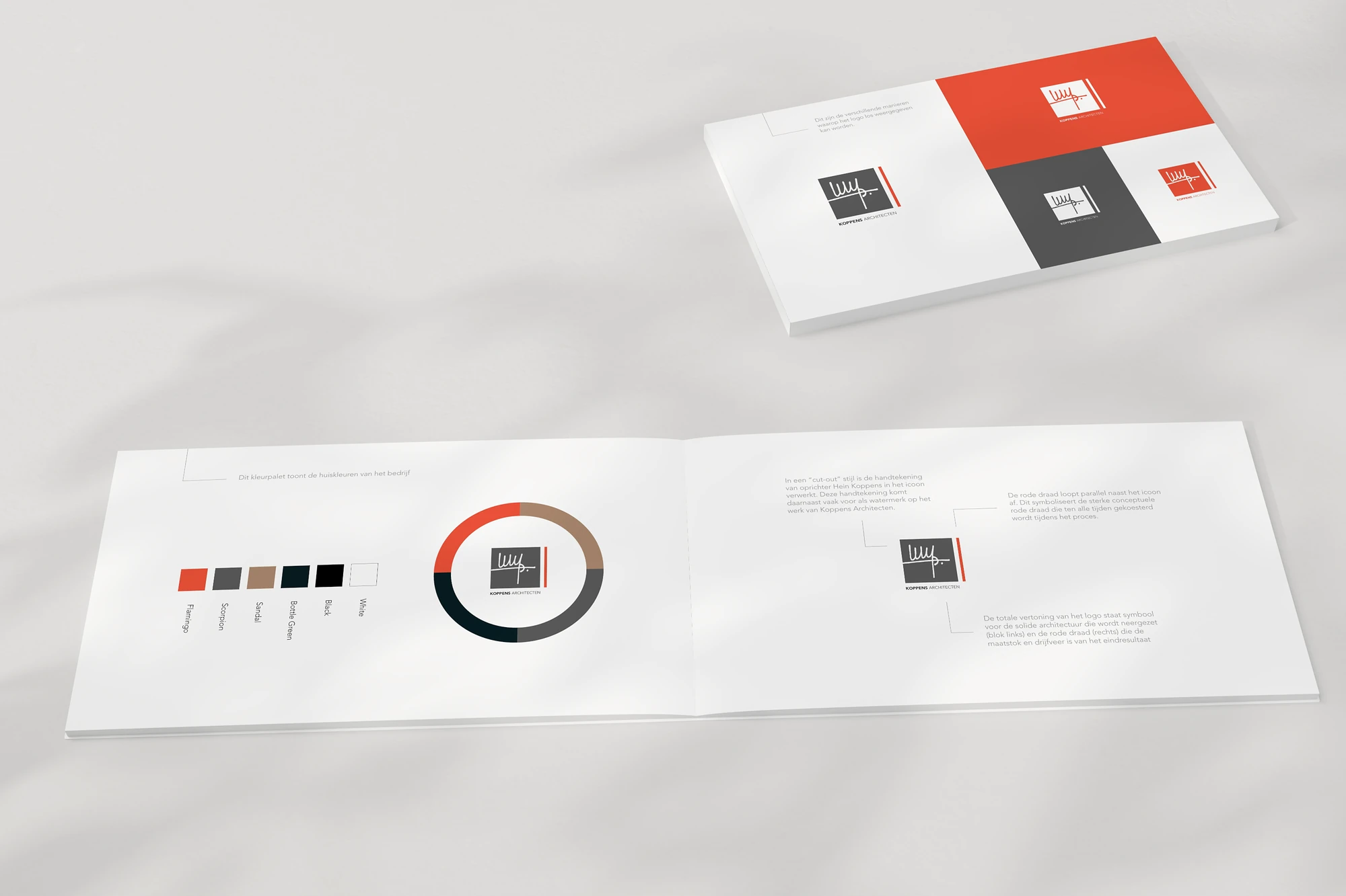
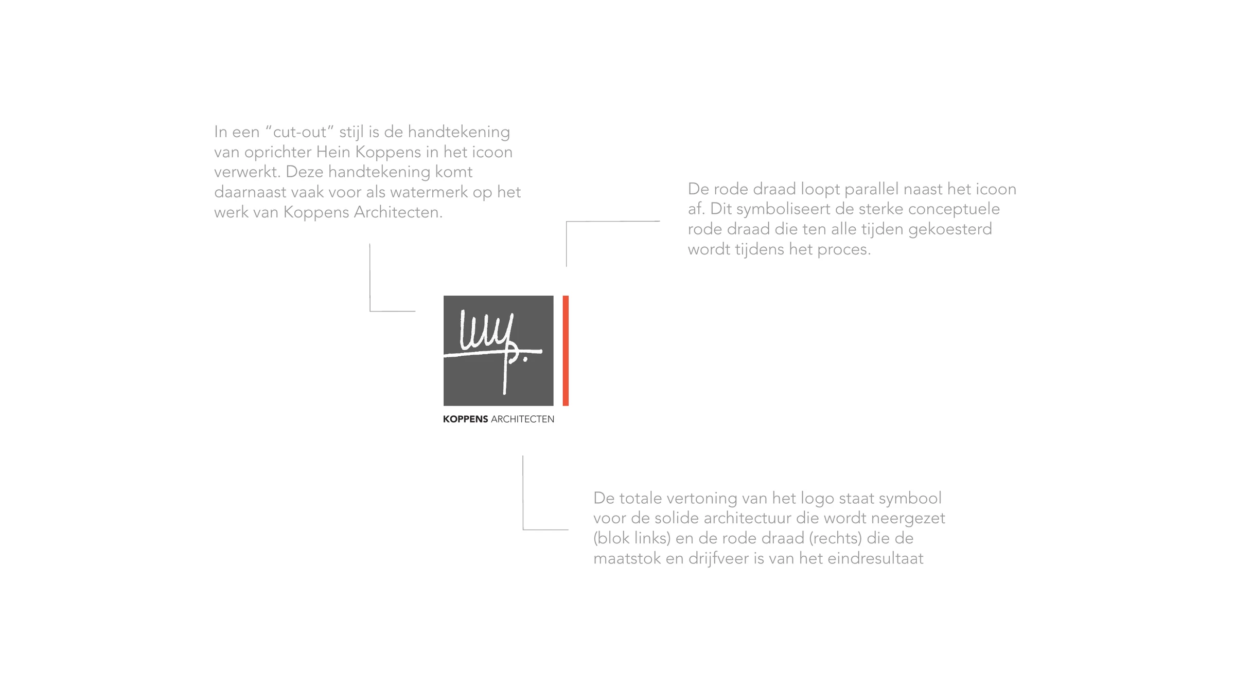
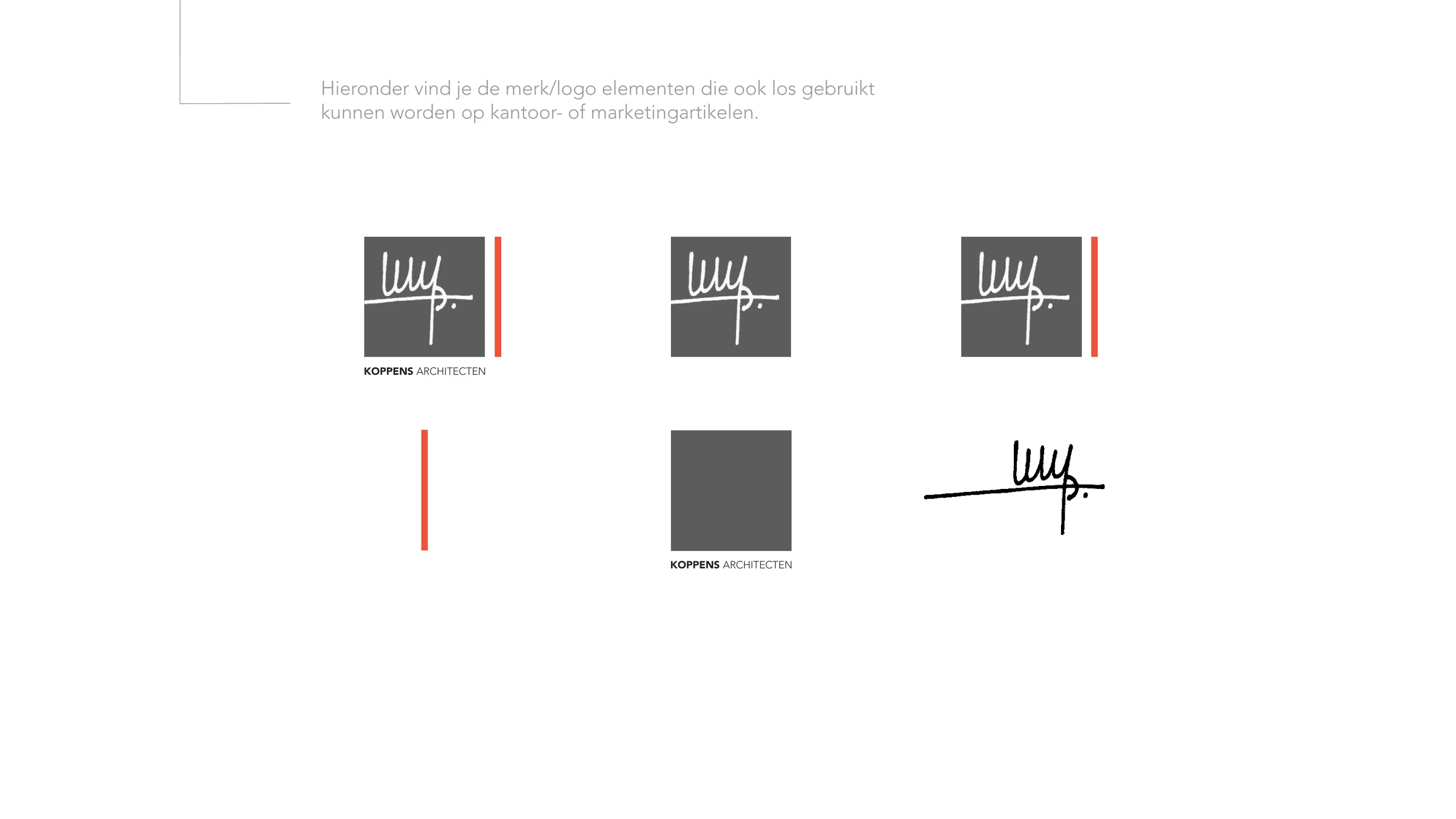
The mark incorporates the founder's signature in a cut-out style; the same signature often appears as a watermark on the firm's work. A red line runs beside it, parallel to the icon: the conceptual common thread that is held on to throughout the process. Together, the block and the line stand for solid architecture, with the common thread as the measure of the end result. The brandbook shows the logo on the different backgrounds, the colour palette of red, grey, sand, dark green, black and white, and the brand elements that can also be used separately, such as the signature itself.
A personal mark with a clear story, captured in a compact brandbook and carried through to the website.

Today may be the day to meet your strategic partner.




 Martijn, Noud and the rest of the team are ready for you.