CLOSE MENU
OPEN MENU


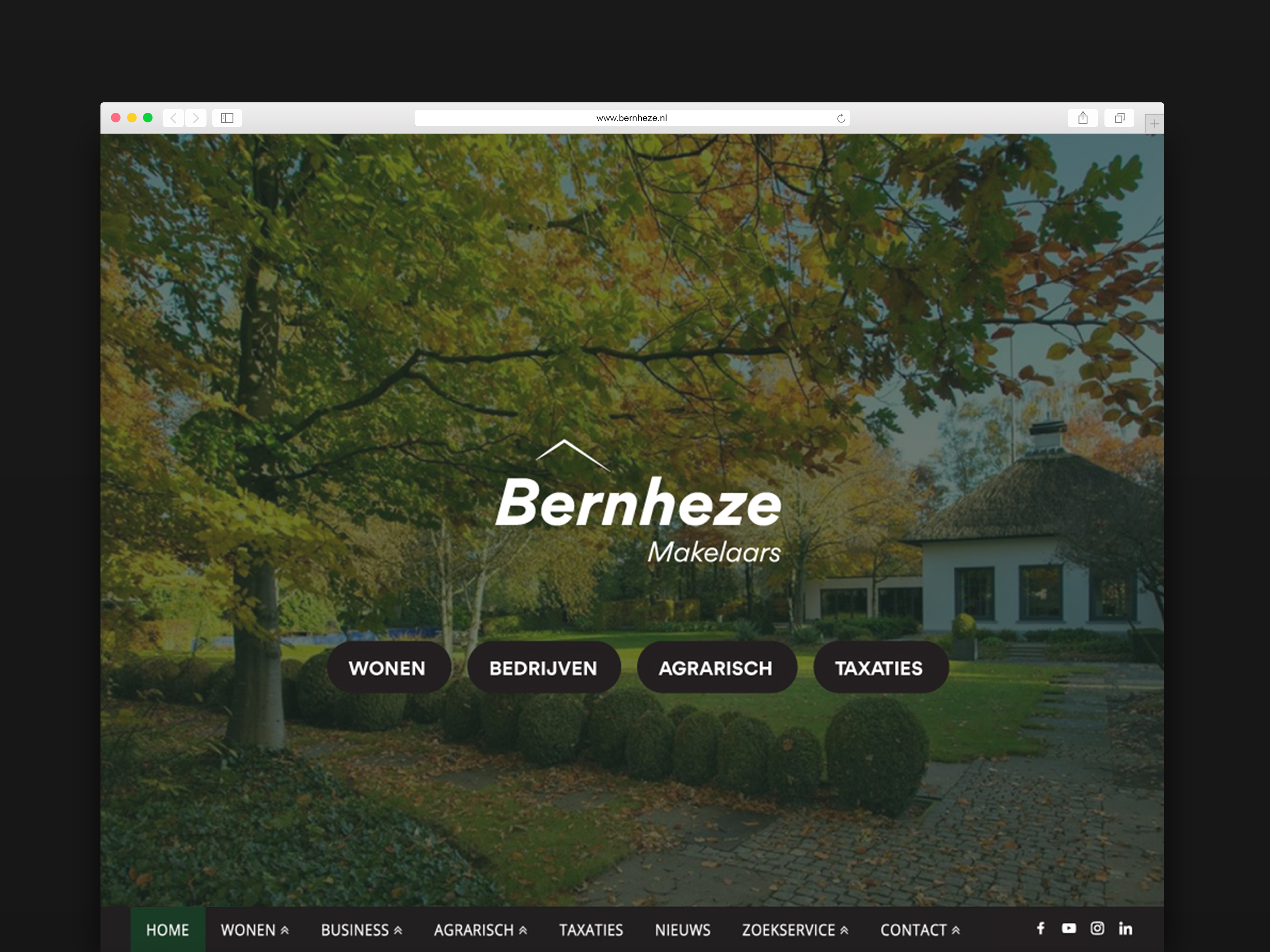
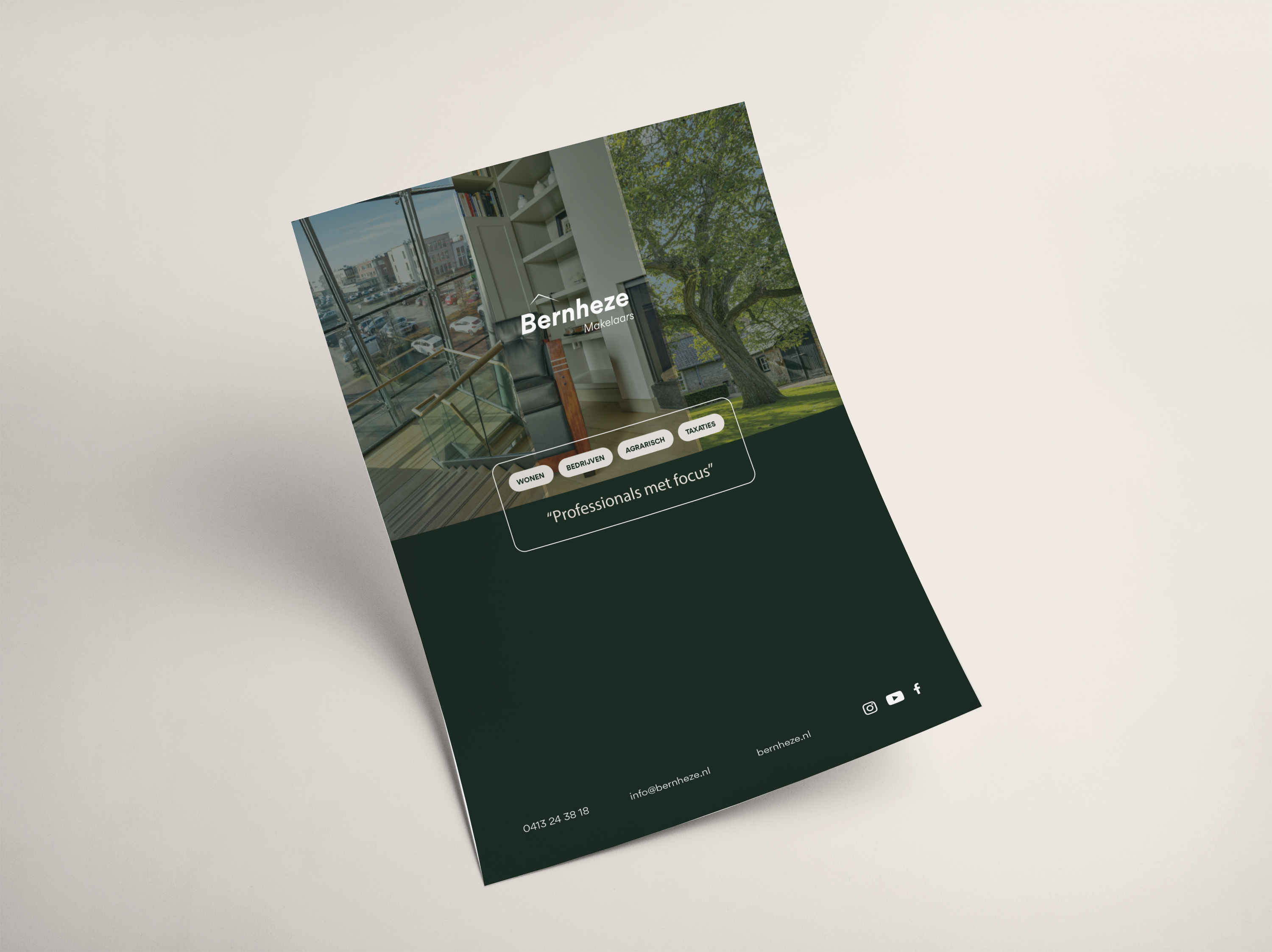
We refreshed a brand that was already there for 20 years. A challenging trajectory with multiple stakeholders resulted in a subtle change with much effectiveness.
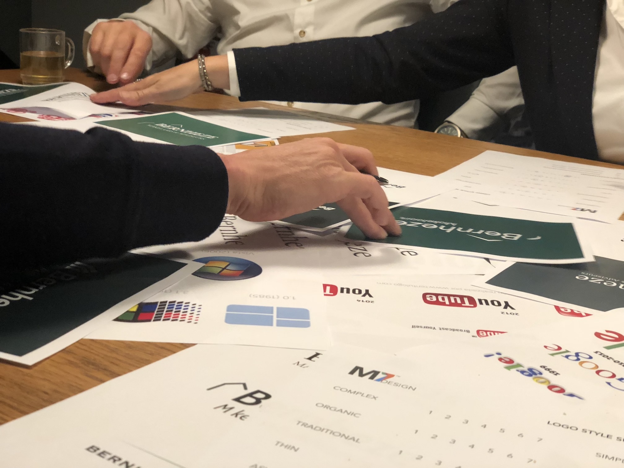
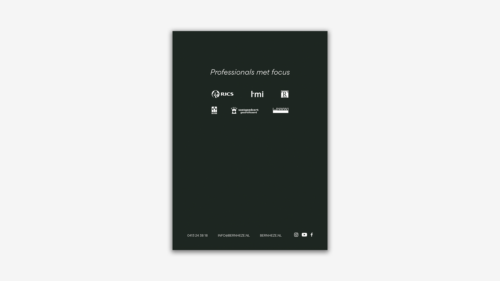
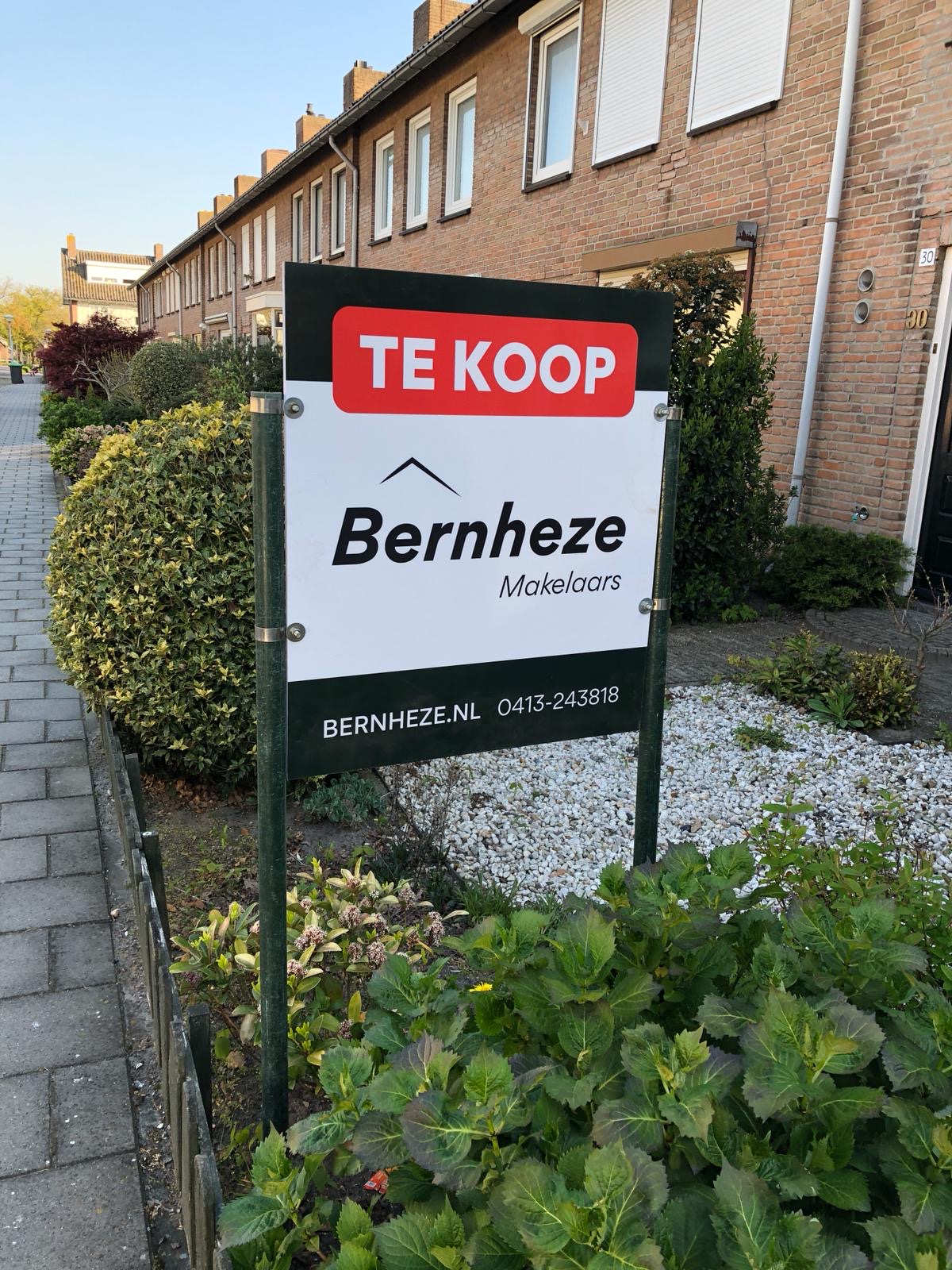
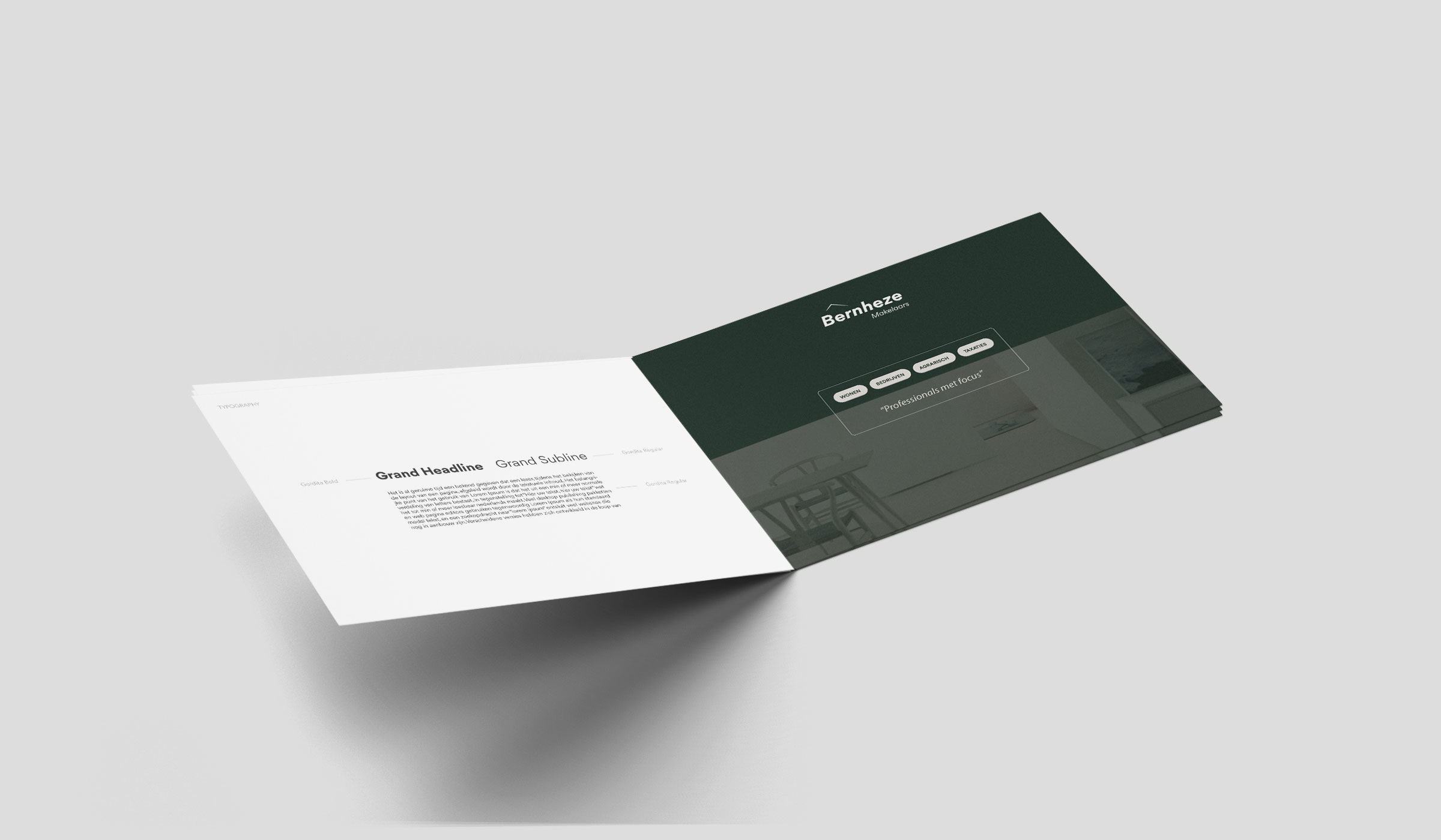
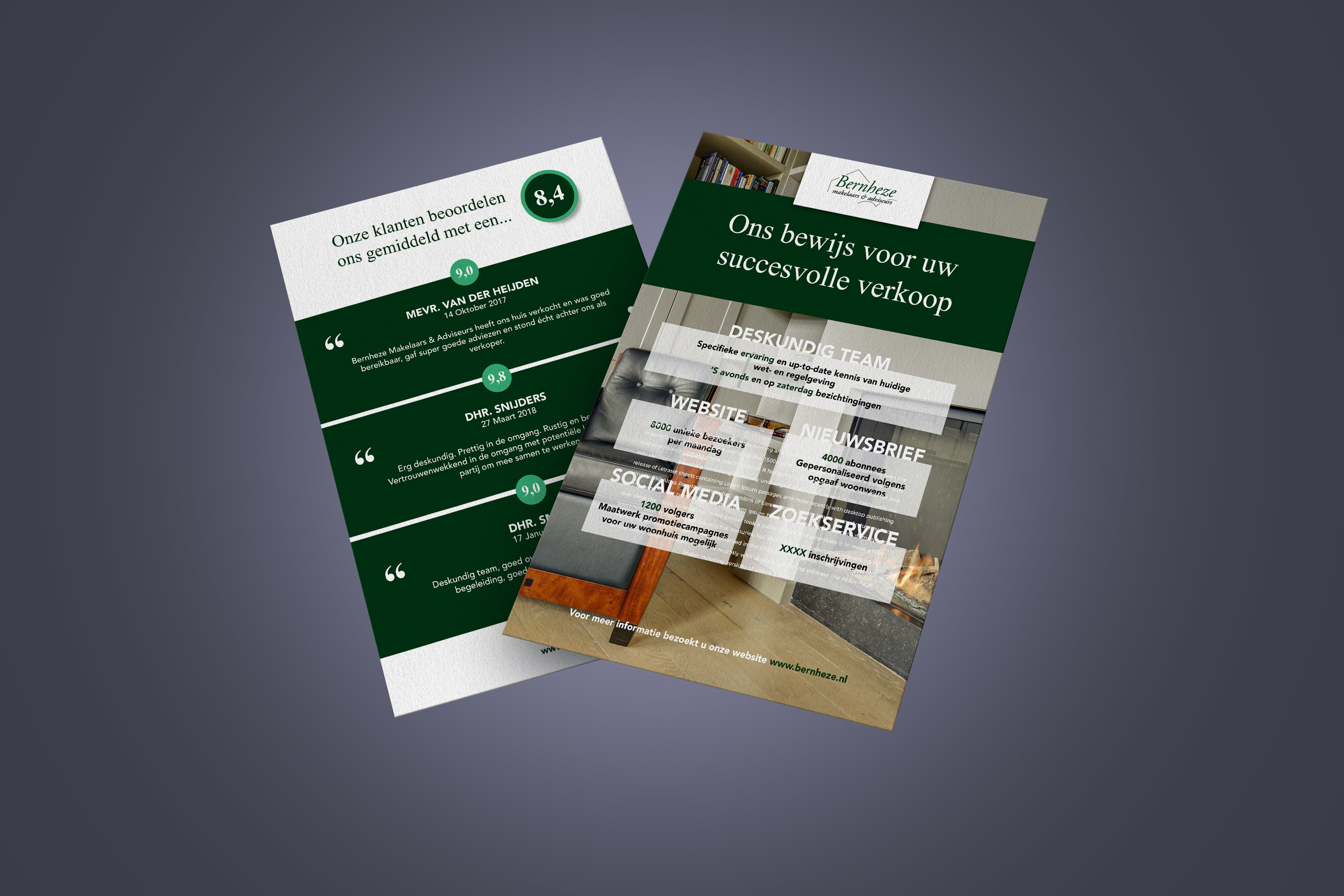
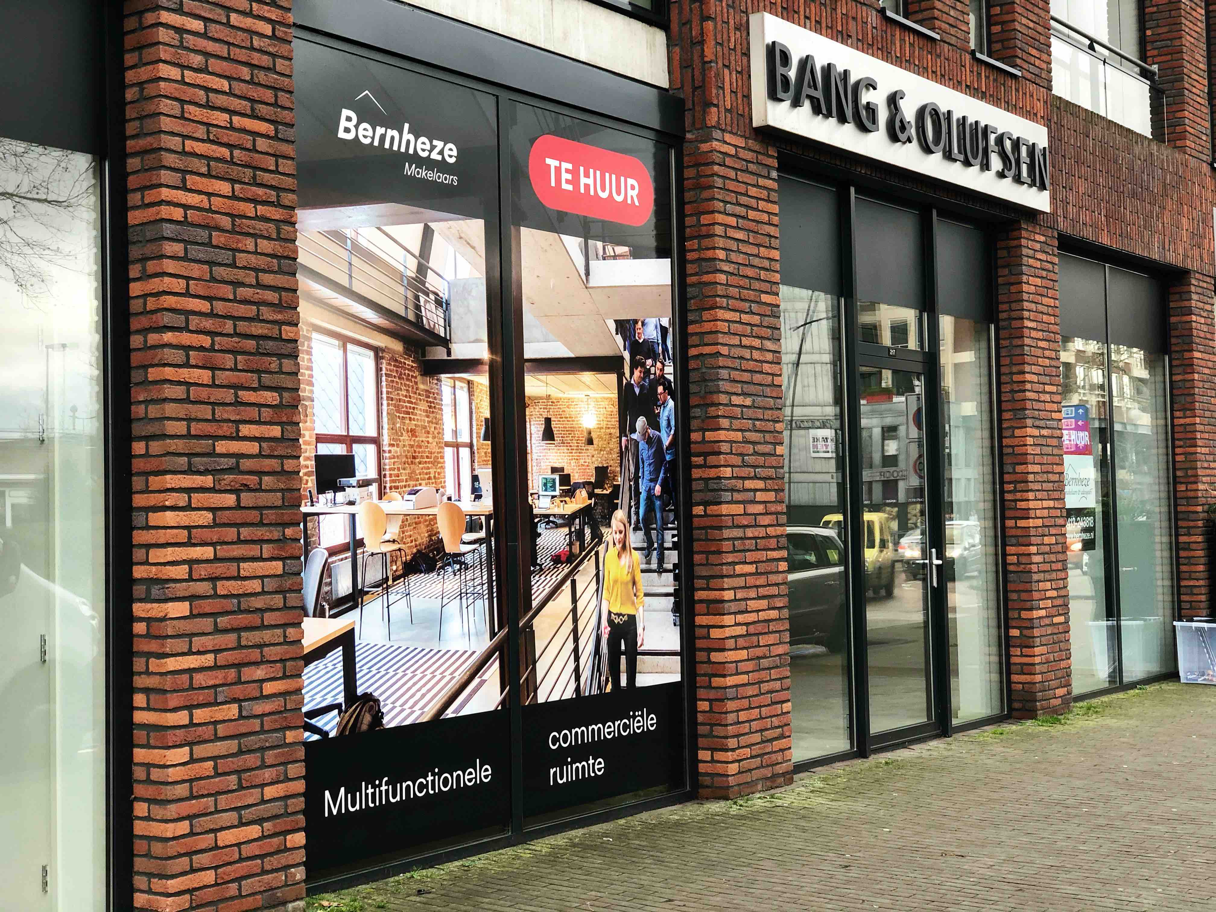
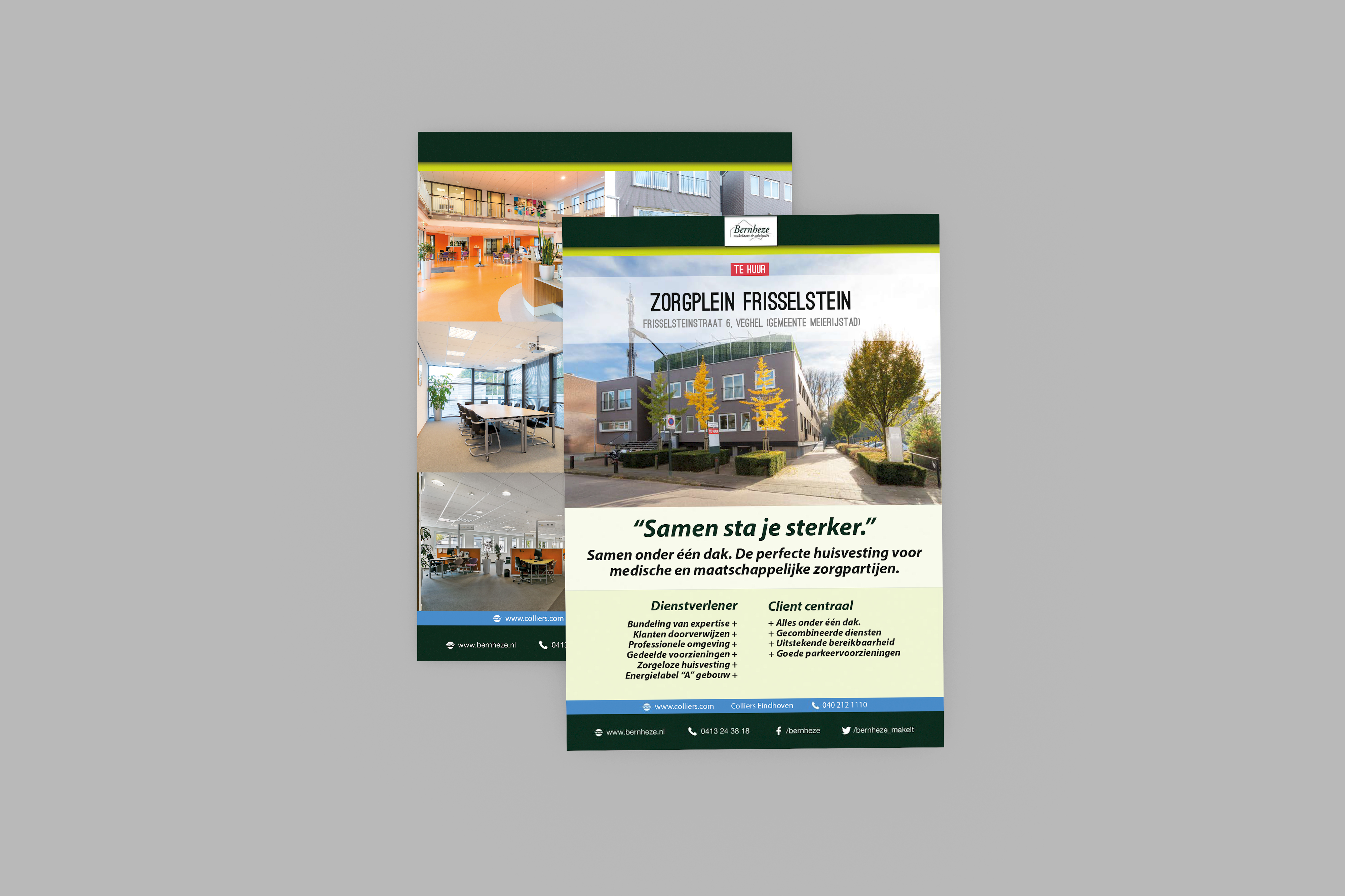
Bernheze Makelaars approached us for a full-stack rebranding of their corporate identity that has been a solid icon for 20 years. Initially, we set up a branding trajectory with the management team to tackle this with structure. We started with the original identity, vision/mission and core values of Bernheze Makelaars - illustrating their position in the market and the brand status that they want to establish. After a couple of sessions of brand archetyping, we determined that the brand of Bernheze Makelaars best matched "the ruler": without any fancy marketing, the brand should communicate the essence – experience, quality of service and authority. Secondly, we initiated corporate identity sessions to collect the ingredients for a new visual appearance. By using style frames and by collecting feedback on multiple iterations, we came to a final logo. Also, we summarized all new visual guidelines such as brand colors, typography, iconography and usage of images in a Brandbook. This brandbook has marked the milestone of a great co-creative process of setting up the new brand's boundaries and conditions. With these in mind, we applied the new visual style and designed several products such as their important "for sale" signs, business cards, stationary, presentation kits, roll-up banners and flyers.